Wednesday, 22 January 2025

Editing


Editing

This post was made by me and outlines the editing process for the final music video

Most of this post was made by Nathan.

Final Timeline:


using tricks I learnt from the teacher such as syncing the performance clips to the song, then setting their opacity to 0 for scenes where they're unused, it has saved me some time during editing


Color grading

Scene with friends (warm):


Scene without friends (cool)


For the scenes where the main character is alone, I've decided to edit it to be bluer than the scenes where he has somebody along with him, the blue tone was chosen as it is often associated with loneliness, solitude and coldness. That coldness I wanted to convey as I wanted to portray being alone as that uncomfortable coldness

The process of color grading was quite rushed as I was used to editing single photos at this point and often times it takes me 5 minutes more or less to edit one photo, furthermore, the color grading settings on the editing software I used was quite different to the app I often use so it was a little bit of a learning curve. 


Aspect ratio


I didn't use a traditional 16:9 aspect ratio common to many screens and chose to use 2.35:1, also known as the cinemascope aspect ratio or resolution, the reason for this is due to my genre conventions often having black bars displayed in their music videos, furthermore I wanted to mimic an anamorphic lens' stretch in order to try and capture the music video in a way that mimics the gear of usual indie music videos which often also use anamorphic lenses

Lastly, by having a wider aspect ratio, it allows for the focus of the viewer to be less on the top and bottom where in our music video nothing happens and instead focuses on the center third of the screen, giving an easier viewing.


Self Reflections: Nathan were in charge of this editing section. But overall, he did a very great job while doing it in a short span of time and with limited clips of stockshoots. I think in the future, I have to dived in into this section in order to expand my skills tree.

Tuesday, 21 January 2025

Digipak : Research and Development

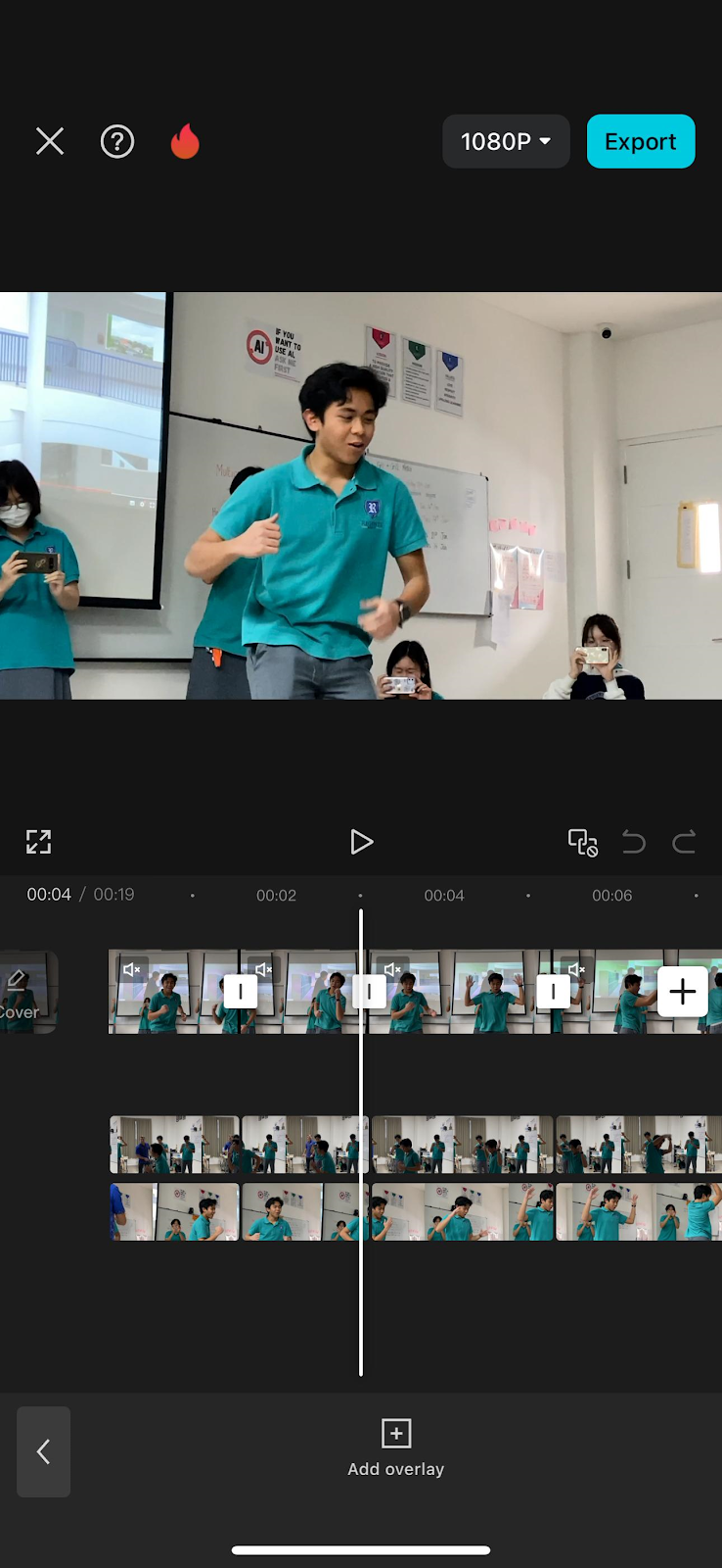
 This is the Digipak Research & Development of our group, Most of this was made by Louis


In this blogpost, I will show the album covers and digipak backsides that I've looked at as inspiration for my front cover and back cover digipak, as well as my progress in creating the digipak.

Here are some indie album that I've taken a look at for my digipak

These Indie album covers seem to follow a convention of having grainy imagery of an abstract photo that may have meaning behind it, sometimes being poorly lit. Some album covers also feature duo-toned imagery. The typeface used for all of these covers seem to be sans serif typefaces. These are the visuals that I will attempt to replicate in order to conform to Indie album cover conventions.

Instead of putting all the sides of the digipak in one file, I decided that I'll do it in sections, front cover, back cover, spine, etc.
I will be using the template above that I've found from the internet as a sort of reference to measurements that will be needed for my digipak. Once I've completed the different each section, I will then combine them all in one file according to the measurements and orientation of the reference above.


Here are my first batch of drafts


I used these images as they reflect the sad story covered in the music video. For all of these images, I've followed the abstract hidden meaning convention, where each image has more to it when not taken at face value. 

For my 1st draft (top left) I chose the image, as it used an extreme long shot and some neon lights being shown. I've done this to show isolation and loneliness done by the extreme long shot, and a hint of happiness represented by the minimal colorful neon light, to reflect how the music video's story is how the star has become lonely and lost his friends. The hint of happiness is also shown in the music video when the star was reminiscing the fun memories with his friends.

For my 2nd draft (top right) I also chose this image since it shows someone being alone which explicitly tells the viewer themes of isolation. This is done through the long shot showing no-one around the area except for 1 person in the middle of the screen. However, The hint of happiness isn't represented by the neon light but instead with the yellow-orange street lamp since the colour yellow connotes joy and happiness, though, I think that it's a little too prominent to only show a hint of joy.

My 3rd draft (bottom) was chosen since it shows both the extreme long shot for isolation, and the neon light for a little bit of cheerfulness. The most prominent reason for choosing that image was because it had both those technical elements as well as a sign facing away from the camera. I liked this since it connotes that there is hidden meaning that the viewer isn't able to tell right away, but is present in the cover. Though this could also connect to the hidden reason on why the star had lost his friends, since it wasn't explicitly explained in the music video.

I was unhappy with these drafts as to me they weren't appealing enough for a general audience. I also noticed that I failed to follow the convention of sans serif fonts, so I decided to make a few more drafts for the front cover digipak. I also later realised that the measurements were not the same as the reference.


Here are my second batch of drafts

I used these images since the main song of the album and the album name is "TELEPHONES", and these images feature a telephone. I've done this so that the audience can make a quicker connection to the music video so that they wouldn't need to look to hard to look at hidden meaning so that they'll quickly be able to realise and make connections through the branding.

My fourth draft (top left) had the name of the album on a bit of a corner to explicitly make the audience create connections. I've tried to use a yellow tint to represent the happiness this time, however, I think that the yellow was shown too prominently so it was no longer just a hint and is excessive. Later on the typeface to me seemed too aggressive for a much slower paced song, so I decided to lessen the intensity of it in later drafts.

My fifth draft (top left) I realised that I loosely followed the conventions in the first draft, so I continued with the sans serif typeface that indie covers have, however I added a bit of texture to the title so that It would look too boring. I also got rid of the yellow tint since, it was too excessive in the first one, however I did not find a way to show the small bit of happiness in this draft. even though the serif typface was already used to conform to conventions, I've tried to use another cursive typeface for the band name in order to slightly subvert from Indie cover conventions.

For my sixth draft (bottom) I've changed the serif typeface to be a little skinnier and get rid of the texture since it was it looked too distracting and out of place for me, everything else remained the same, however I've added more texture to make the cover seem a lot more messy and noisy to conform to conventions.

These drafts to me still felt too bland, since the image looked like it was barely touched and I failed to conform to the duotone convention. I've also realised that the latest draft looked to messy for my liking and could be changed to make it still look appealing while it not being to noisy.


These are my third batch of drafts
For my third batch, I've used the same image as the last batch, however this time, I've implemented the duotone convention.

for my seventh draft, I haven't implemented the duotone effect, however I tried to change the placements of the title and band name to make it look more appealing for the audience and less boring. The title colour has also been changed so that it uses the colour blue, to show sadness and connect it with the depressing themes of the song and music video. I've also dimmed down the amount of messy white highlights on the cover since it looked to messy in the previous draft. I've also added a bit of noise and grain to conform to the textured grainy look to Indie covers.

For my Eight draft, I've repositioned the texts so that they were in the original spot, however this time I've added the duotone effect, with the two colours being blue & yellow, in order to show both the happy and sad feelings that the music video connotes. The telephone is mostly the yellow part since the happiest moments of the star was when he could call back to memories with his friends.

For my ninth and final draft, the only thing I've changed is the position of the texts, to make it the same as my sevent draft, while having the duotone colours from my eight draft. Everything else is kept the same.

I feel satisfied with with ninth draft and will probably use it as the front cover of my digipak. I'm beginning to see the theme and visual for my digipak, so I will continue to follow the visuals from the front cover and bring it over to the back cover as well.


Here are some back covers and spine digipaks that I've taken a look at for my digipak

The back of digipaks often give have a track list on the left hand side of the back cover, featuring the songs that are inside of the disc in the digipak. The back cover also shows a bar code on either corners of the back, as well as some legal infringement commonly done near the bottom of the backside. The spines are also included in some of these, where it features mainly only the artist name as well as the album name.

Here are some of my back cover and spine drafts


Here are the first couple drafts of my backside digipak. Since, I've already have a theme and a visual I can follow, it made it easier for me to create the next sections since I've already have an idea for what I need to follow. For my back cover, I used the main song as the first song on the track list, with the rest being lesser non-important songs. I've followed the duotone and grainy visuals I had with the front cover, and I've also included the band's name on the back of the digipak. I've also put the band's name and album name on the spine of the digipak.. I Since these drafts are very similar with the only difference being the placement of the band name and barcode, I think I'll go with the second draft (left) as the official back cover and my spine draft as the official spine.

Here is an example that I found of the inside of an Indie digipak


The inside of Indie digipaks often show the entire band, meaning all the band members in one frame and shot on the inside of their digipaks. Continuing to follow the conventions of the digipak's cover, duotone, grainy,
etc.


These are my drafts for the inside of the digipak, I think they look alright as they follow the conventions and look good enough for the audience. Since showing the members is part of the conventions, audiences also get to see the band members.

Here is the final Digipak in the form of the reference


Self Reflections: In my opinion Louis did a very good job in designing the digipak. He has shown the step by step progresses as well as what little changes he did and adjusted. For me, the album cover has already represent our group persona, which represent and targeted the demographic of a young teenagers at the age of 17+. 

Social Media: Research & Development

In this blogpost, my group decided on the social media presence for our star to be reflected in our products (social media posts, music video, etc)

RESEARCH #1: VACATIONS


What do they post on their social media page? Can you group the different posts into categories (eg Personal, promotional etc)

Just like other bands, the Vacations share updates and activities for their fans to keep them informed about the band's current state, endeavors, and other aspects related to the band. What adds a personal touch to their account is their sharing of daily behind-the-scenes activities. They also frequently post memes that are mostly related about themselves, which adds a more relaxed and playful vibe to the band. This contributes to the development of their image as a fun and laid-back band on their social media pages, contrasting to their musical persona that they've shown in the music (composed). In addition to sharing personal insights, they also create promotional content, primarily focused on their tour schedules that include dates and locations for their concerts.

Does it feel personal or is someone else creating content for them?

Their social media profiles come across as more personal instead of being managed by a team or a corporate that filters the content of their post for the sake of their official accounts. It seems that their goal is to connect with the audience by presenting themselves as relatable, choosing to be seen as a humble, and fun band rather than as glamorous or formal superstars.

Do fans have the chance to interact and engage with a. The artist b. Other fans

Fans of VACATIONS is possible to interact with the artist (a) through the instagram comment sections, but it seems that the band choose did not make any interaction with the fans throughout their social pages. It seems that instagram acts as an update of what are they up to and an announcement of tours; basically, an update of their activity in general. But, fans can still interact with the other fans (b) through the comment sections, and it is most likely to discuss and share their thoughts about the band's posts.

How does the artist promote their music?

They promote their music/bands through their social media pages while posting memes to maintain a relaxed engagement of the band between their audiences. They're the most actives in Instagram and Tiktok, as they got the most engagement on those social media platform.

How has this soc media influenced you?

We would like to conform the meme posting contents that they did in their social media pages, as we want our band to be known the same way as them, which is a playful and easy-going persona that we show in social media. The reason why this is necessary is because we want


RESEARCH #2: REALITY CLUBS


What do they post on their social media page? Can you group the different posts into categories (eg Personal, promotional etc)

On their social media platforms, they post updates about the band’s activities and share information regarding their current situation to keep their fans in the loop. Furthermore, they have recently uploaded mini-vlogs showcasing the city they are visiting for their latest concert series, known as the BUZZ Tour, which they refer to as "stage journal." They also seem to be promoting their merchandise through their social media channels. Overall, their social media posts are mostly well-polished and professionally edited.

Does it feel personal or is someone else creating content for them?

For Reality Clubs it looks like a team of social media sections and photographers are behind the band while developing, creating, and filtering contents that are allowed to be posted to the band's social media page.

Do fans have the chance to interact and engage with a. The artist b. Other fans

In the majority of their social media updates, there is no indication that the band replies to or engages with comments from their fans. The comments section is consistently filled with fans sharing their support and motivational messages for the band. When the post pertains to an upcoming concert, attendees express their enthusiasm about the band performing in their cities, which boosts engagement and excitement among fans. While they may not communicate on social media, they do connect with their audience during live performances.

How does the artist promote their music?

Reality Club promotes their music through social media, such as Instagrams as the main platform. Other than that, they also promote their music through live performances and world tours (e.g. BUZZ Tour) in order to increase the awareness for their new music amongst their loyal fans. Not only that, they feature they're new released on their social media bio.

How has this soc media influenced you?

The vibrant neon colors on some posts inspired us to assign a unique color theme to each member of our band. For example, the neon color associated with Louis would be red. When he is the spotlight/at least present in a post, ambiance of that post will closely reflect the color red as well. This color will be symbolising the personality of the respective member.

1st drafts


This is our first social media draft, where we tried to visualise what will our band's social media post looks like at first.


2nd draft

Here is our official instagram account after we posts some pictures.

Self Reflection: This social media research and development is useful for us to get to know the visual appearance and how does an ideal social media post from our celebrity looks like? and what meaning does it conjures? In addition, the research also helps us in developing an ideal social media posts for it to be accepted by our targeted demographic audiences.

Monday, 20 January 2025

Branding Research and Development

 This is my branding


this is a mind map that me and my team have created for our branding that was scanned by our teacher


Self Reflection: This mindmap quite helps us in brainstorming our band identity and brand, basically this mindmap identify and guides the identity of our band later on as well as how will the social media persona looks like, up until what kind of visuals will it be presented by the brand.

Monday, 13 January 2025

Production: File Organisation


File Organisation

 Here is my file organisation


here is my personal file organization


(I stored my images in Whatsapp, as most of my pictures were stored in my phone. And more importantly, my OS:C is almost full so that is why my numbers of downloads is small. To save my storage, I decided to copy or dragged image instead)

This is our group's local file organisation, instead of dividing it into sections, it's divided into dates so that it's easier for us to organise the files and isn't a hassle. However, most files and folders before this were created, however was very messy and were not named properly.

Self Reflection: I don't think it plays a major role for me while doing this project, as long as you remember where to put your files, I think we can access it anywhere. To minimize we forgot where we put our files, we decided to keep the number of files minimum.

Production: Behind-teh-Scenes

This blogpost will include clips of our group shooting behind the scenes and our roles during the shooting. Beside from that, it will also include problems that we encounter during the shooting process and how we overcome it. [THIS BLOG IS MADE Haresha and Ata]


Members and Our Roles

Nathan - Cameraman and Actor

Louis - Actor

Ata - Actor

Haresha - Actor

Non-Members and Their Roles

Saka - Lighting & Gofer

Behind the Scenes

BTS #1: THIS IS WHEN WE SHOOT FOR THE FIRST TIME, WE TRIED TO IMITATE A SCENE WHERE A GROUP OF TEENAGER IS STROLLING AROUND A MALL CREATING MEMORIES, WALKING AIMLESSLY. THIS IS OUR INITIAL IDEA FOR OUR SCENES AND IT IS OPEN FOR AN IMPROVEMENT. 
BTS #2: THIS IS WHEN WE RESHOOT SOME SCENES AS WHAT OUR TEACHER ADVICED TO. THIS RESHOOT CAN ALSO ENRICH OUR STOCKSHOOT CLIPS AND SCENES INCASE SOME CHANGES ARE NECESSARY TO BE MADE IN THE MIDDLE OF EDITING. THE CONCEPT OF BESTFRIENDS STROLLING THE MALL STAYS THE SAME, BUT THERE ARE SOME ADDITIONAL ACTIVITIES IN THE PROCESS, SUCH AS ARCADE.


Problems and The Solutions

  • Rain at the beach
    • Solution: Rather than waiting for the rain and run out of time, instead, we shoot indoors in the basement parking lot of Living World Mall
  • No permission to shoot in Living World Mall Basement
    • Solution: we switch to another alternatives and we decide to shoot in our friend's neighborhood.
  • Dark Video Clip
    • Solution: We find position with better lighting.
    • Solution 2: We borrowed our friend's motorcycle for its headlights
  • Late for sunrise shooting
    • Solution: We decide to reschedule the day.
  • Limited cameraman to shoot the whole group (only one cameraman, Nathan)
    • Solution: We use tripod to shoot the whole band.

Self Reflections: This behind the scenes is useful for us to reflect on our mistakes that we encounter during our shooting processes as well as how are we as a team resolves it and then prevent it from taking our time. The pictures above might gives you some illustration on how our recording process is going on behind the music video scenes. It highlights how we set up the places, camera, and the actor's position during the recording.


Classwork/Mini Project: Multicam-Continuity Editing

In this blog you can find the work I did on how to edit with multiple cameras. My group filmed the footage, but I edited it together. My teacher provided a template for the blog post. 


Multicam Editing

In my own terms, multicam editing can be defined as combining or compiling multiple camera angles, shots, and footages of an object or subject into one single video that has multiple shots taken from different angles; the general example for this can be seen in Montage editing. The purpose of doing this is to show a dynamic and more eye-catching videos taken from multiple angles, instead of boring static angle that may discourage/disengage audience with the scene.

Shooting Process

Firstly, our teacher picked one of our friend (Louis in this video) as our subject for the multicam editing. He asked him to make any movement while we as a class record him in different angles and positions to add variations into our clips and stockshoots. Then, our teacher yelled "rolling...camera..actions!" in order to timed our recording to be perfectly or atleast at the same time we hit the record button. After that, we shared our raw clips to our own groups, which we will be editing the clips with our own creativity and our liking later on.

(BEHIND THE SCENES IMAGES): LINK HERE

Here are the raw videos from my group members:

1. Haresha's raw video


2. Ata's raw video


3. Nathan's raw video

https://youtu.be/Pn8qkHtrEcc


My editing process

  • Upload the videos to the editing software (CAPCUT) 

  • Detach the audio of the clip you wish to use in the final video. 

  • Find the ‘clap’ marker on the audio.

  • Line up the video files together. 

  • Cut where I want the edit to happen

  • Don’t delete the clip, just lower the opacity. This way it can be used again later. 

  • Mute all clips except for the one you want to use. 


Here is some clips of my editing processes, where to match a scene with another scene I lowered the opacity and then edited them by cutting or removing some durations.

Here is my edited videos prototypes:
1) videos i made in class

In my opinion this is a bad editing as I don't have enough preparations to export the raw videos
(update: I lost this video, so I decide to upload a new one)


Here's the final video
The audio is appeared to be mixed as I've realized just now (D-1 submission) that my video is gone, so I advice you can mute audio if it gets overwhelming.


Self Reflection: This project helps me visualise and understand how to edit a multicam angle video. Our teacher Mr Nick suggest a trick overlaying and reducing the opacity of some clips to zero in order to make the transition between different angles to be seamless, this way we don't need to delete videos one by one too. Here I experiment a montage cuts with different angles while matching my friend's movement in one scene to another scene to make it even smoother.