Here is the thumbnail research and the development process where we show our progress in making the thumbnail (the front cover of the documentaries)
Below here is my independent researches on criminal documentaries that is not related to my groupmates work, I want to put it here as a proof of learning something new which thrives me to do my work later on.
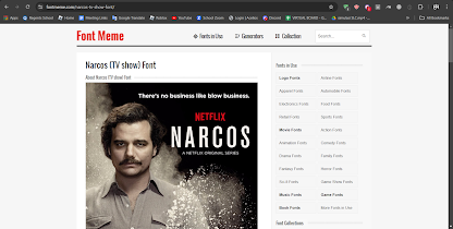
In the beginning, I started by looking at some crime related film project posters, to get a good idea of what mostly the fonts need to be like, as well as gathering inspiration on which font to use and how I would use them in my final project's documentary thumbnail. I used fontmeme.com to take a look at some posters, as I feel like this website quickly shows me what poster of thumbnail it's form, as well as the name of the font
Eventually I was satisfied with the font used in Narcos where it looks simplistic and modern, the look I was trying to go for for my crime documentary. However, I later found out that the information about what font they used was wrong, and it looked slightly different from the way it looked in the thumbnail. because of this, I decided to manually look for the font used from Narcos.
Afterwards, I looked at some Netflix thumbnails to get a good sense of how I should frame my thumbnail. Most crime documentary thumbnails in Netflix have their title on the left hand side, as well as having a red N to signify that it's a Netflix original while having a main subject about the documentary be on the right hand side. So then, I began working on my thumbnail and started by making a few designs
I was very excited with my first draft, and I really liked the way it turned out. I included an image of Resha, who is the celebrity, as well as an autograph on that image, so signify that he's a popular person. I also added blood splatter across the screen to follow crime documentary conventions having blood splatter in their thumbnail, as well as giving a hint that murder is present in this documentary.
I tried to include Resha in the title since the documentary is about how his popularity lead him to doing bad choices. I was unhappy with this design, as I felt like it looked a little bit too cluttered. I really like the previous design, however I needed to incorporate Resha's name into the thumbnail somehow without making it look too cluttered and tacky
Eventually I stuck with this design, having a subtitle called The Resha Case, taking inspiration form Curry and Cyanide's title choice since I feel like it would fit nicely and in the thumbnail using the same font but a thinner version to make it look less messy and cluttery
(Most of thumbnail research is done by Louis)
Self Reflections: Louis did a great job executing our ideas into one single thumbnail and he also managed to finish it in a very last second of submission. Personally, I really love the signatures on the photograph and the blood splatters. Usually a fan would ask for their idol to sign a photos of the idol so that the fan could keep it by themselves as a collection. This may strongly depicts that Haresha is a celebrity and the blood splatters that could indicate many things, one of them that the blood will somewhat and somehow related to this famous singer and we know blood splatters on screen will always end in a very bad ending.


No comments:
Post a Comment