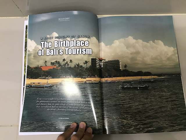
Here are the images for my magazine cover, contents page, and double page spread.
Wednesday, 21 February 2024
Critical Self Reflection
Here is my critical self reflection for the magazine project.
The link to my critical self reflection in case the embed doesn’t work: https://www.canva.com/design/DAF7Vj0bKwI/Zz5-XwOSjeMNC7XZMaGxhw/edit
Sunday, 18 February 2024
Contents Research and Development
Here is my Magazine Contents Research and Development
Saturday, 17 February 2024
Front Cover Develpment
Here is where I will be updating the research, the progress in the making of my magazine's front cover.
Here are some magazine cover references that I use as inspiration and ideas to build my own magazine covers. I follow a conventions for the Keris magazine where
This color is too gloomy, pale and too gray, the atmosphere of the picture would be good if it's a magazine about mourning loved one's demise. This will make the reader wondering what will be the mood of the magazine, might discourage some people because they're too confuse with the mood I am trying to set here.

I am starting to add the masthead for the front cover page. I uses the outline red for the sub heading to indicate how determine I am in this project. The font color white symbolizes purity which is the philosophy of the keris itself, made from purifying minerals from unwanted object. The type face I am using ended with line strokes, as this type face means traditionality, classic, and formality.
My friend said that the Keris needed to be shown more and make it the "main star" of the front cover. In order to follow his suggestion, I have resized the picture and make it a lot bigger. And now it appears more stands out than before.
In this version, I edited the color and the quality of the keris picture a little bit as well a s making the picture less blurry as one of my friend said that the picture is so blurry and i tried my best to use an online picture enhancer remove blurs, and I am quite satisfied with the color.
During the making of my double page spread, I realize the flow of the content doesn't only revolves on a niche district which is previously outlined as Bali, but rather I discuss the culture not just in Bali but also in the Java Province. And for that I decided to change the sub-masthead from The True Nature of Balinese Art to The True nature of Indonesian Art as I am representing more than one region in this case. And this is my final front cover page.
Magazine Layout Tutorial
In this post, I will demonstrate some basic design skills that I learned in class.
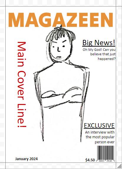
1. I started by Sketching my magazine covers. I am not really satisfied with my drawing as I am not skilled enough to make a sophisticated result on it.
2. Then my teacher told me to experiment with some default magazine layouts.
Here's some improvement I've made using border guidelines, as well as adding colors and resizing some texts.
3. Next, my teacher shows us elements on
- Borders
- Hierarchy of type (Times New Roman, Comic Sans)
- Typeface
- Colours


