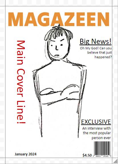
In this post, I will demonstrate some basic design skills that I learned in class.
1. I started by Sketching my magazine covers. I am not really satisfied with my drawing as I am not skilled enough to make a sophisticated result on it.
2. Then my teacher told me to experiment with some default magazine layouts.
Here's some improvement I've made using border guidelines, as well as adding colors and resizing some texts.
3. Next, my teacher shows us elements on
- Borders
- Hierarchy of type (Times New Roman, Comic Sans)
- Typeface
- Colours


No comments:
Post a Comment